If you think about it, your website, and especially your home page, are a direct presentation that you give your audience of your brand. There are many different characteristics that make a website great, but the homepage is the first thing that many users see. Even if someone does end up on a landing page, navigating to the homepage to see what else you have to offer is usually a next step. Before we dive into examples, below are just some of the features that make up a killer homepage design:
- It is clean, sharp, and not overwhelming to visit
- It clearly presents who you are and what you are about
- It communicates important aspects of your company to your target audience
- It changes as it needs to
- It includes appropriate and visible Calls to Action (CTSs)
- The design is visually appealing
- It takes mobile devices into account
I have picked out 7 websites that do all of these things, and more, exceptionally well and lead to a killer homepage design. If you have something you’d like to add to the list, let us know in the comment section below and tell us why it’s a killer website homepage design.
-
Warby Parker: A Scrolling Experience
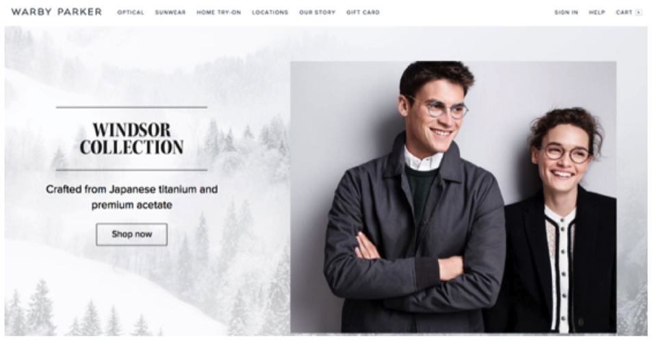
Warby Parker is an eyeglass site where customers can try on five eyeglass frames at home with free shipping and no initial cost. They make their mission very clear on the site with a scrolling page that begins with their newest collection and ends with their program, which donates a pair of glasses to someone in need with every purchase.
What makes this site killer?
A clean sleek look that utilizes a homepage that scrolls. The use of the scrolling home page allows more information about the product and brand’s mission to be displayed without having to overwhelm a fixed screen. It’s more engaging and more interesting, so it keeps users hooked while offering more information and great graphics.
-
Dollar Shave Club: A Clear Product Explanation
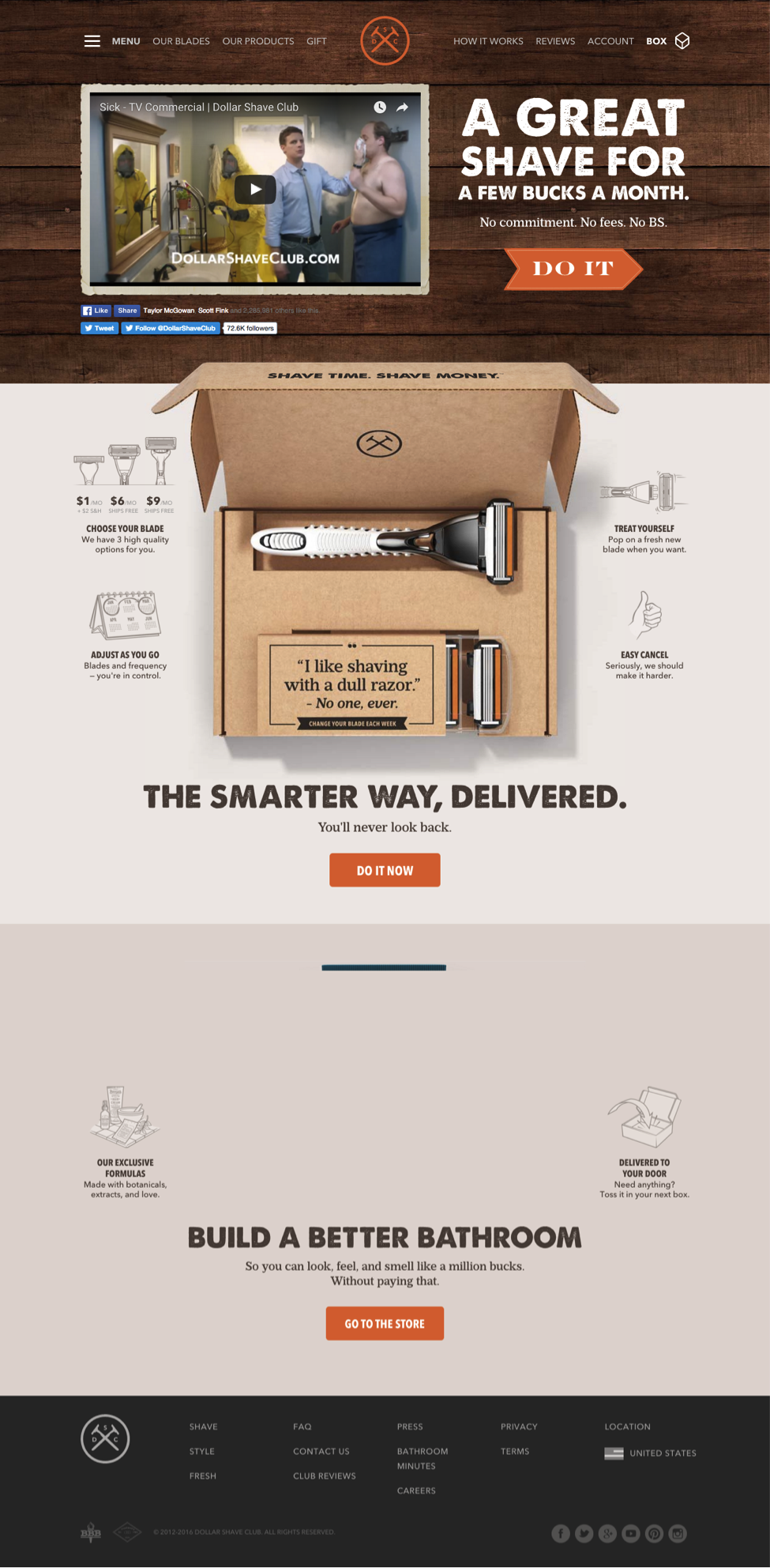
The Dollar Shave Club is a program that men and women can use to get 4 razor blades delivered monthly for a cost much lower than razors in-store. They promote the idea that shaving with a dull razor is not only unnecessary with their product, but that it is also the “stupid” thing to do with an option as great as this.
What makes this site killer?
They clearly explain their brand and what they are all about right there without having to click any further. At the top of the page there is a video that details the program, but as you can see, there is also a clearly labeled infographic, which lays out the program and makes it seem incredibly easy. This site does a lot of things right, but its clear product explanation definition is what put it on our list.
-
Career Builder: A Search that Can’t be Beat
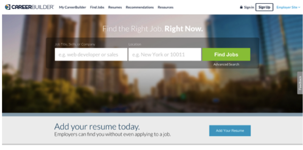
Career Builder is a site that posts job listings for people actively looking for employment in a variety of fields. Their home page directly displays a search bar for people interested in the services they offer. This may seem like an odd one to put on the list because it’s not a small business that offers a tangible item, but it makes the list for a reason.
What makes this site killer?
Sometimes, depending on your business and brand, the primary goal is allowing people to search content on your site. Why try to hide that feature if it is your primary goal? Make no mistake, Career Builder definitely made their search feature and call to action buttons prominent for a reason, and it definitely distinguishes them! You’ll find this design on a lot of B2B websites as well because it’s so slick and easy to use, so it’s a popular one.
-
SkinnyMint Tea: A Homepage Slideshow that Says it All
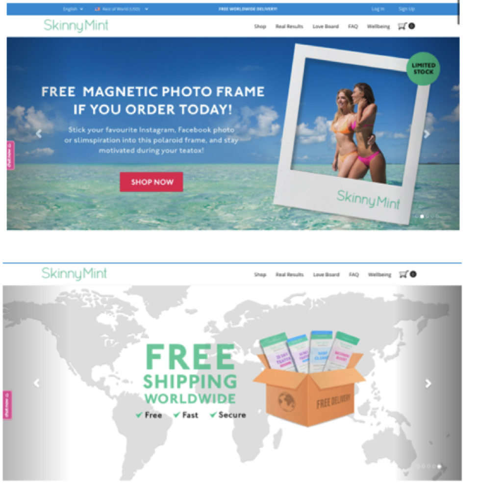
SkinnyMint is a company that sells detox tea and products. Their target demographic is generally women who want to lose a few excess pounds or detox from unhealthy eating/drinking. There are a lot of sites that could really benefit from a slideshow like they have on their home page. The above screenshot is just what you see above the fold, but there is some great information if you were to keep scrolling and wanted to learn more.
What makes this site killer?
Like the first example, the use of a slideshow presentation on the home screen is perfect for this company’s services. As you can see from the screenshots above, each slide shows a different important component of the company. The first shows a free gift with purchase, the second free shipping, and the third, product results. This is a great way to present information quickly to a new audience or returning customers that may not know the latest promotions. Their content is really keeping up with the times, which you can learn more about here and how that relates directly to web design.
-
Ohh Deer: Link that Social Media
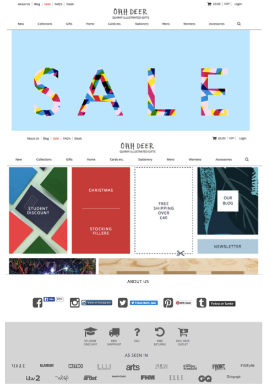
Ohh Deer is another company that really utilizes the website home page scrolling feature well. This site specializes in handmade gifts, cards, and other specialty items. As you can see from the screen shots, as you scroll down you learn more and more about the products offered (which are also in a toolbar at the top). The top section of the home page currently advertises a sale, and as you scroll down you get more detail with a clean design that is not overwhelming in the slightest because of the way it is set up.
What makes this site killer?
What stood out to me about this site is the social media and magazine features listed at the bottom of the home page. You probably did not recognize the name of this company when you first saw it on this list, so for a new company it does a great job of establishing credibility and linking to every social media account possible. If you are a start-up or a newer business, I highly recommend featuring social media links at the bottom of a scrolling home page. It allows people to connect with you easily, while also establishing rapport when you might not have it just yet. If you pay attention, you’ll see that many companies use this tactics on their homepages, B2C and B2B businesses alike.
-
Toms Shoes: A Website with a Purpose
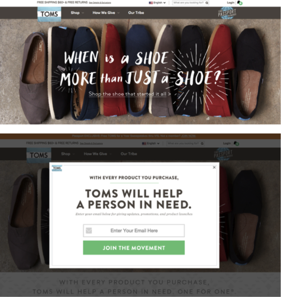
What is the purpose of your site? Your mission? Tom’s Shoes has a mission to give a pair of shoes for every purpose to a person in need. Maybe you can’t make moves quite that bold, but the reason I like this site is applicable to many different brands and businesses.
What makes this site killer?
The mission statement is clear. There are a lot of design features I like as well (including the pop-up featured in slide number two for email entry, which is helpful for your email marketing). However, this particular example is really more about making a statement and doing it well. Whatever the purpose of your company is, you want to put it front and center in your ecommerce web design without hesitation.
-
Spotify: Clean, Appealing, and Spot-On
Spotify is a music hosting site which users can either use as a free platform, or subscribe to premium to avoid commercials (along with other features).
What makes this site killer?
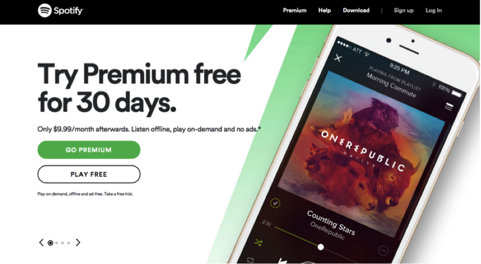
This site really uses all of the features of web design that everyone should strive for. It is clean, appealing, and direct. If anyone had questions when going to this site they would be able to find it easily. Best of all, it is just really visually appealing. This example demonstrates what good web design can do for your home page and set you apart from other brands or businesses that may be marketing the same thing. Lastly, the toolbar at the top is also very direct and not overwhelming at all. With a simple “log in, sign up, premium, help, and download” option, there your eye is drawn to the most important aspects quickly.
What are you trying to improve about your web design? Let us know in the comments section below.
