If your conversion rate is dropping, or you find yourself at the low end of “average”, try not to beat yourself up. Your conversion rates don’t necessarily reflect the quality of your product or the innovativeness of your business strategy. You could simply just be making some common mistakes that many, many business owners make but that directly impact your consumers’ ability (and willingness) to convert. So if you’re not happy with your conversion rate, try looking for the answers somewhere new…you might surprise yourself with what you find. Here are 5 places you can start your search!
1. Your website doesn’t make a good first impression.
There are a variety of reasons as to why your website isn’t impressing your visitors. And if you have a high bounce rate and low conversion rate, this is a good place to start. Does your site look unprofessional? Is the quality of your images poor? What about your logo design? Is it clear, eye-catching, and does it reflect your business well? Also consider the white space on your site; you should have enough that your content doesn’t look crowded, but not so much that users have to navigate through miles of white space to find the information they’re looking for. Finally, your fonts should be clear, consistent throughout your site, and easy to read. If you don’t have a background in web design or don’t feel comfortable taking on a project of this magnitude, this would be a good area to outsource.
2. Your site isn’t optimized for SEO and mobile.
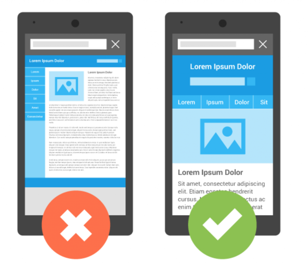
Your website content needs to be optimized for keywords and for mobile search. If it’s not, it won’t pop up in the SERPs when consumers enter in search terms, and so they won’t even realize your site exists. Furthermore, people are searching from mobile devices more than ever, so your website needs to present well from mobile and tablets. A user isn’t going to stick around and wait for your site to load, or try to navigate around images that are too large…they’re just going to bounce. So do yourself a favor and check to ensure your site is optimized.
3. Your content is mediocre.
Content should be written with your audience at the forefront; if you write generic copy that doesn’t target a specific audience, you’re going to swing and miss big. Each product description should appeal specifically to the buyer who’s most likely to purchase it.
Your content should be interesting, informative, descriptive, persuasive, well-written and error-free. If your copy is boring and full of errors it will reflect directly on your business; even if readers can get past the uninteresting information (which most won’t even bother) error-ridden content will send the message that your business is unprofessional and doesn’t value an attention to detail.
4. Your CTAs are weak.
A good CTA will convert- it’s as simple as that. So if yours aren’t, you need to reevaluate your language as well as their placement on your website. Call-to-actions should be strong, specific, and visible to your audience. Generic CTAs like “download now” or “buy now” are uninteresting and won’t compel a buyer to click. Your CTA needs to be relevant to the specific product or action you’re asking your users to take. For example “schedule your free consultation” or “download your free copy!” are much less generic CTAs than “click here”.
Additionally, it doesn’t matter how compelling your CTA is if your audience can’t see it. It needs to be a contrasting color and placed in the middle of your web page. The font should be noticable, and the background image(s) should be simple so the CTA doesn’t just blend in. Neil Patel says that if you can’t spot your own CTA in 1 second or less, it needs to be redesigned.
5. You aren’t using popups effectively.
Contrary to the belief of some, popups are still effective in today’s marketing…when they’re executed well. Exit popups, for one, are a great way to grab the attention of your visitor before they bounce from your site. Good popups have an attractive design and a clear and engaging CTA that leads to a great offer that a user won’t be able to pass up. If you include a form, make sure it’s simple and easy to fill out…think, 2 form fields or less. Anything more will be too complicated and burdensome for your users; if they see a bunch of fields that need to be filled out, they’ll bounce before they even read the copy.
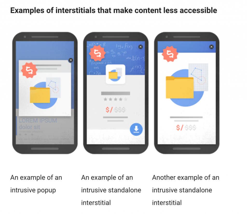
Additionally, your popups shouldn’t be intrusive, according to Google. Popups that stand in the way of users accessing content are considered intrusive, and your site will be penalized for using them.
If you’re not happy with your website’s conversion rate, start by modifying one or more of these 5 marketing tactics. You’ll increase your sales in no time! And for more information on how to transition leads to conversions, check out this article! If you have any more ideas as to why a website may not be converting, please share them in the comment section below. We can’t wait to hear from you!
feature image credit: newbreedmarketing.com
image 1: developers.google.com
image 2: vicicollection.com
image 3: vicicollection.com
image 4: webmasters.googleblog.com


