It’s hard to go anywhere on the Internet without some kind of contact from or reminder about social media, whether it’s page likes, status updates, tweets, Instagram photos, or LinkedIn connections, to name a few. And because it’s so hard to escape the chaos of social media, it seems like nowadays people are viewing their email as safe spaces; places where they can control what goes in and out, how it’s organized, what gets saved and deleted, etc.
That being said, email marketing can be a tricky business to get into; it’s great when it works, but you also take the risk of being permanently rejected if you don’t go about it the right way. The Kissmetrics Blog uses the analogy that a person’s email is like their home, and so you better mind your manners:
“Getting into someone’s inbox is like being invited to their home for dinner. If they ask you to take your shoes off, you respectfully do so…remember, you’re in their house.”
The translated version of that metaphor essentially means that in order to establish a successful marketing campaign, you should first get permission from the customer. Then you can attempt to get “whitelisted” (marked as a “friend” so your email doesn’t go right to the junk folder). Afterwards you should follow-up, and then determine what the right time is to make your pitch. Finally, use analytics to track your progress.
These are the basics you need to master before you can up your email marketing game. Once you’ve got that down, you’re ready to move on to the next level.
How to Take Your Email Marketing Campaign to the Next Level
Read below for some tips on how to dominate the field of email marketing. Keep in mind that you don’t need to include all of these in your campaign. Pick 1 or 2 that stand out and go from there.
-
Keep your emails clear and concise.
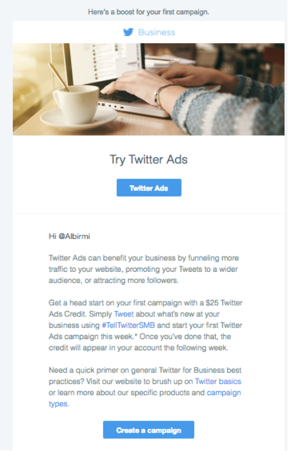
Very few people have time to read a novel of an email, especially when essentially it’s an advertisement. Any emails you send out should be short, sweet, and to the point. Even better, include a clear header that states the main point of the email. Your customers will thank you when they don’t have to go searching for it (because most likely, they won’t). This email from Twitter explains exactly what it’s about in a clear, uncluttered way, and instead of going into detail about Twitter for Business, it includes links to additional information if the customer is interested.
-
Make your pitch relatable to your audience.
I know one thing that always attracts me in emails is when I find a pitch that relates to my life; something that I need, want, or have been thinking about. Sometimes I don’t even realize I need or want it until I receive the nice little reminder in my email. Even if I don’t make a conversion, I’m much more likely to read the email rather than hit delete if the headline taps into my interests.
As a business, this is all about understanding your audience. Track their behavior online, notice what they share on social media most often, where they come from when they navigate to your site, etc.
-
Give warning about any changes.
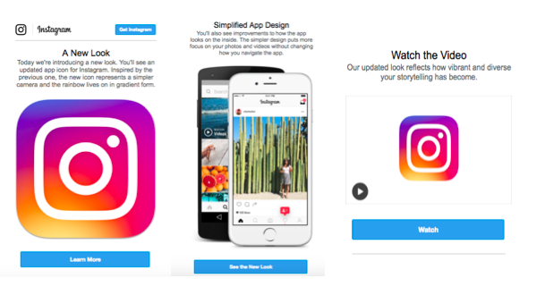
There are few things more frustrating than getting used to a website or an app format and then having it change unexpectedly with no notice and no direction on how to navigate the new version. Unfortunately (or fortunately, depending on your personality) in the world of technology change is generally unavoidable. So take a tip from Instagram and send a warning (and some clear directions) before you make a major change to your site. An email is a great way to do this.
-
Include animation.
Email marketing tends to look the same. Including animation in an email can seem very risky, but it can be a great way to stand out from the crowd if done right. For this tip, it’s all about speed. Your emails have to load quickly if you want this to work.
You’re more likely to keep your customer engaged longer solely because something moving is going to catch their eye. And if they stick around a little longer to see how the animation ends, they’re more likely to view your pitch as well. This fun email from Rent the Runway plays around with animated confetti to reveal a special they’re offering.
-
Use email to try to reel back in customers who have abandoned your page.
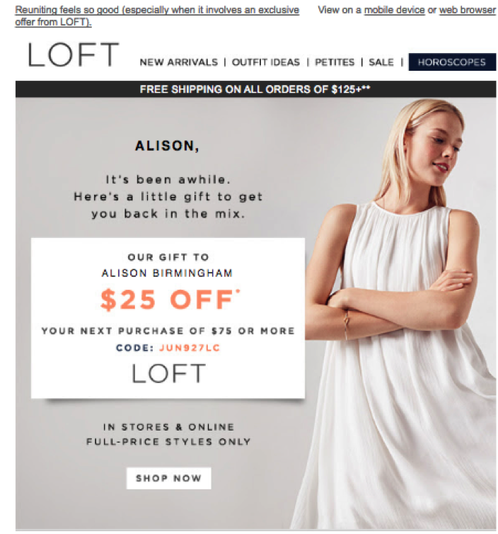
If you find customer abandonment is an issue with your business, try using email to get them to come back. Even better, include an incentive like a coupon, discount code, or something free in the email. You’re much more likely to convince them to revisit your page, or their shopping cart, this way than by simply ignoring the problem. If you’re lucky, they’ll even be thankful for the reminder and show their gratitude by making a conversion. Take the LOFT email example above. As a nice touch, they even included an address to the closest store at the end of the email (as if I don’t have the location memorized).
-
The unsubscribe process is part of email marketing.
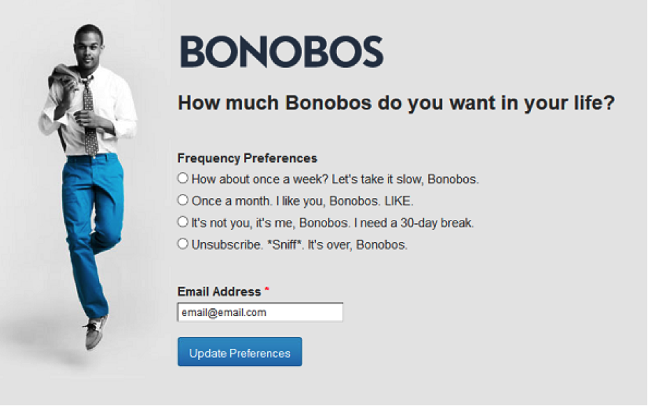
I recently went through a faze where I unsubscribed to almost all of my marketing emails in an attempt to clean out my inbox. I was pleasantly surprised, however, when I landed on the unsubscribe page and was given the option to customize the types of emails I received from certain businesses. Learn more about successful unsubscribe pages here.
-
Include an urgent call-to-action.
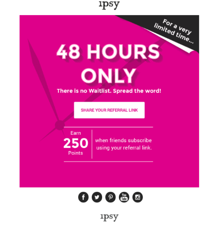
This is an old-school technique that hopefully you already know about, but it’s worth mentioning just because it’s so important. If you want customers to make a conversion, use a sales pitch that encourages them to do so. Even better, make them feel like if they don’t buy something, right now, they’re going to miss out. In this example from Ipsy, they emphasize a deal for 48 only (and they even reiterate this point with the “for a very limited time” tag in the corner), encouraging existing customers to refer new customers to the site right away. They also include a nice incentive of 250 bonus points to help seal the deal.
-
Write like a human, not a robot.
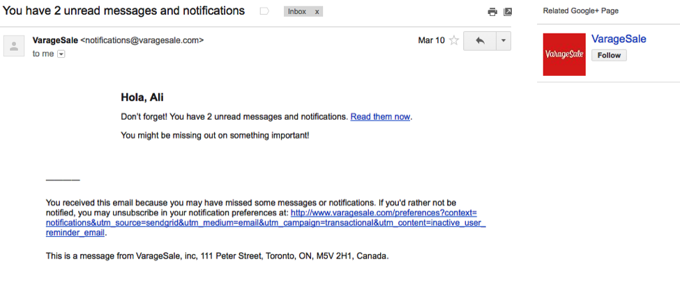
Try to make your emails sound witty, personable, or funny. People are much more likely to respond positively to an email that makes them laugh as opposed to one that sounds generic and automated. See this example from the app VarageSale. Though I’m pretty certain this is an automated email reminder telling me to check my account, the use of the word “hola” and the casual phrasing of the text makes it seem much more affable. They even make the effort to change the greeting to something new every time they send an email.
-
Include pictures.
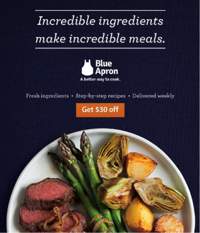
Nothing sells a food site better than pictures of delicious meals that you want to eat right through your computer screen. Nothing makes me want to buy clothes more than photos of new styles looking fabulous on models. It doesn’t matter that I can’t cook, or that I’m not a 5’10 120lb model with amazing hair. I’m not thinking about that when I’m looking at those photos; i’m hooked, i’m engaged, and I want what I see. Throw in a coupon and I’m sold!
Photos stick in people’s minds much longer than text does, so even if I don’t make a conversion right then I’m more likely to continue thinking about it and thus more likely to return and make a purchase later on.
-
Make the customer feel special.
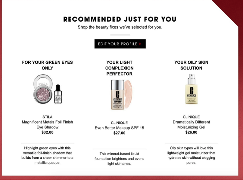
People love personalized attention. It’s a scientific fact. So why not create an email that makes the customer feel like it was designed specifically for them? Make them feel like they’re getting something that no one else is getting. Take this example from Sephora that shows they understand what type of makeup works best with this particular customer. Most likely the consumer will be happy that your business has taken the time to get to know them, and to send them things that you think they’ll be interested in. Also, they’re more likely to make a conversion if they’re surrounded by things that they like and are interested in.
So now that you know how to make your email marketing campaign as amazing as you imagine, where are you going to start? This article and this one too are great places to check out for more real life examples. Post your comments in the section below!
